Ask the Pod
Desktop and Mobile design – UX Designer
Problem Statement
There is no much valuable content on the podcasts but they are time consuming, hard to remember or take notes especially when you are listening on the go. There needs to be a way to optimize this experience where in the user can create summary or ask questions so as to enhance the learning experience.
Solution
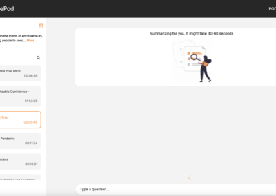
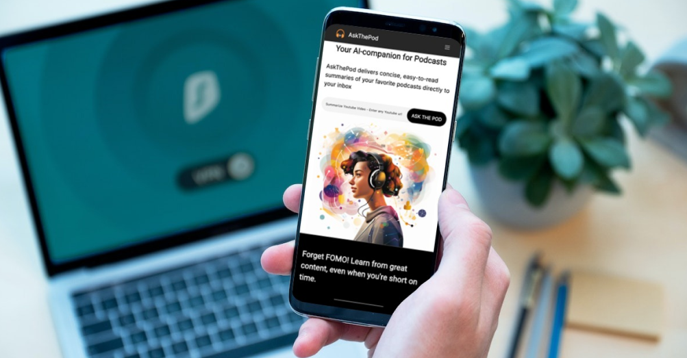
AskThePod uses AI to summarize long podcasts and youtube videos, works as a personal podcast memory bank, and gets the answers from the podcast. The goal of this project was to design Ask the Pod that lets the user
– Create summaries that are 3-5 mins long and capture the main ideas from the lengthiest podcasts.
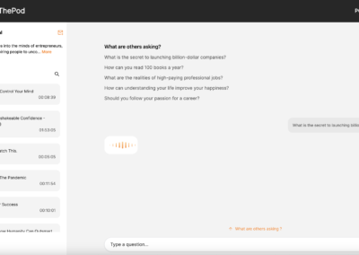
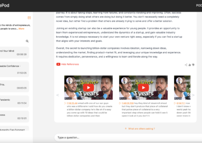
– Interact with the podcast by asking questions.
– Go back to the exact timestamp where the question is being answered.
My Role
UX Designer
Brainstorming
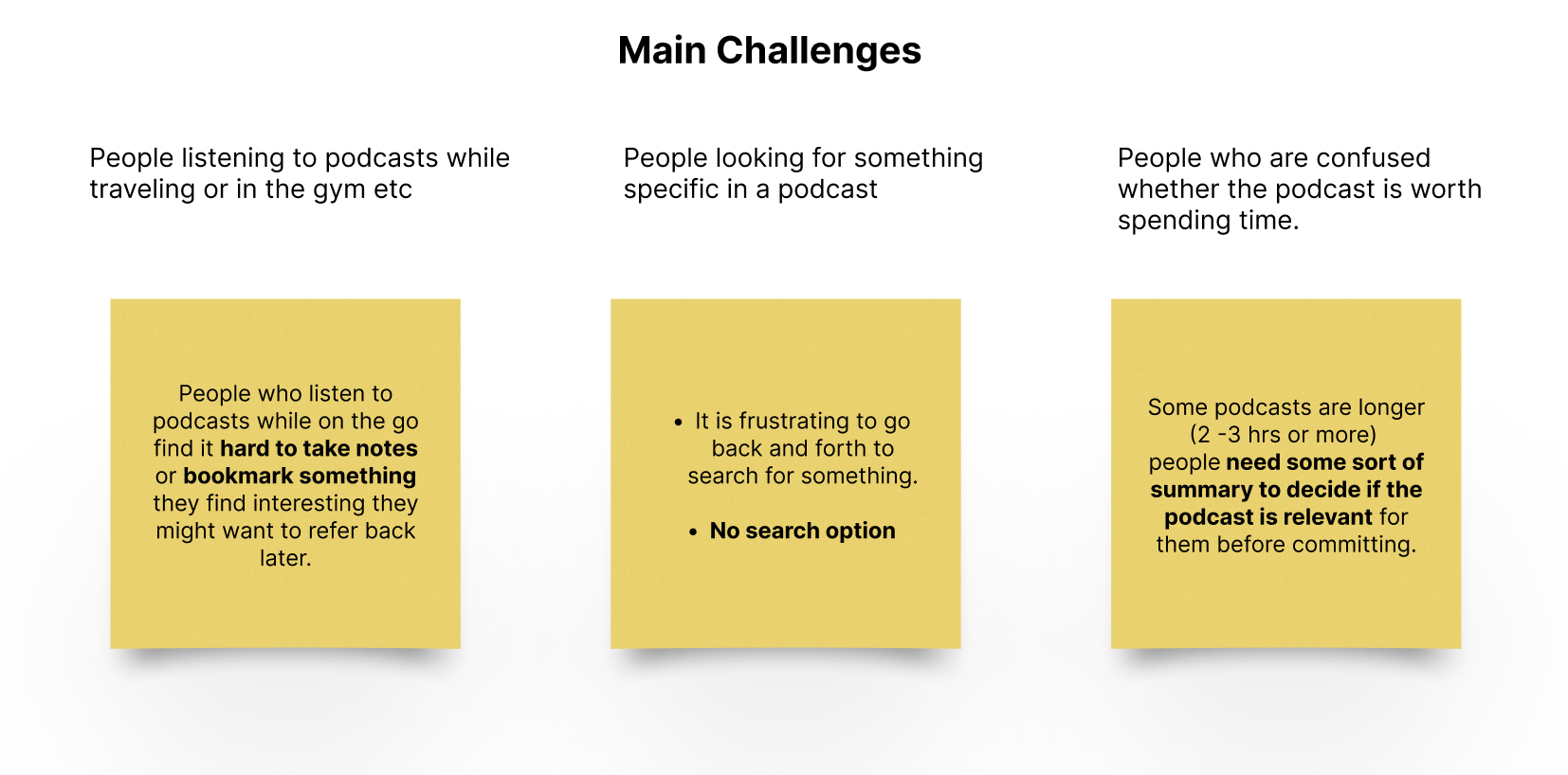
During our initial discussion we discussed who the users would be, their needs and what exactly their challenges are. I spoke to 3 people who are podcast junkies to understand their needs. These are the common themes that came up.
User Flow
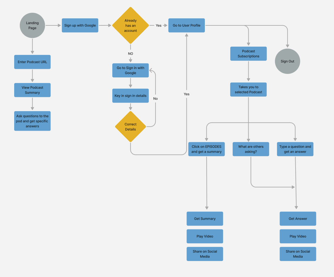
I created the user flow using figma to document the series of steps and the interactions the user would follow though the whole process.
Wireframing
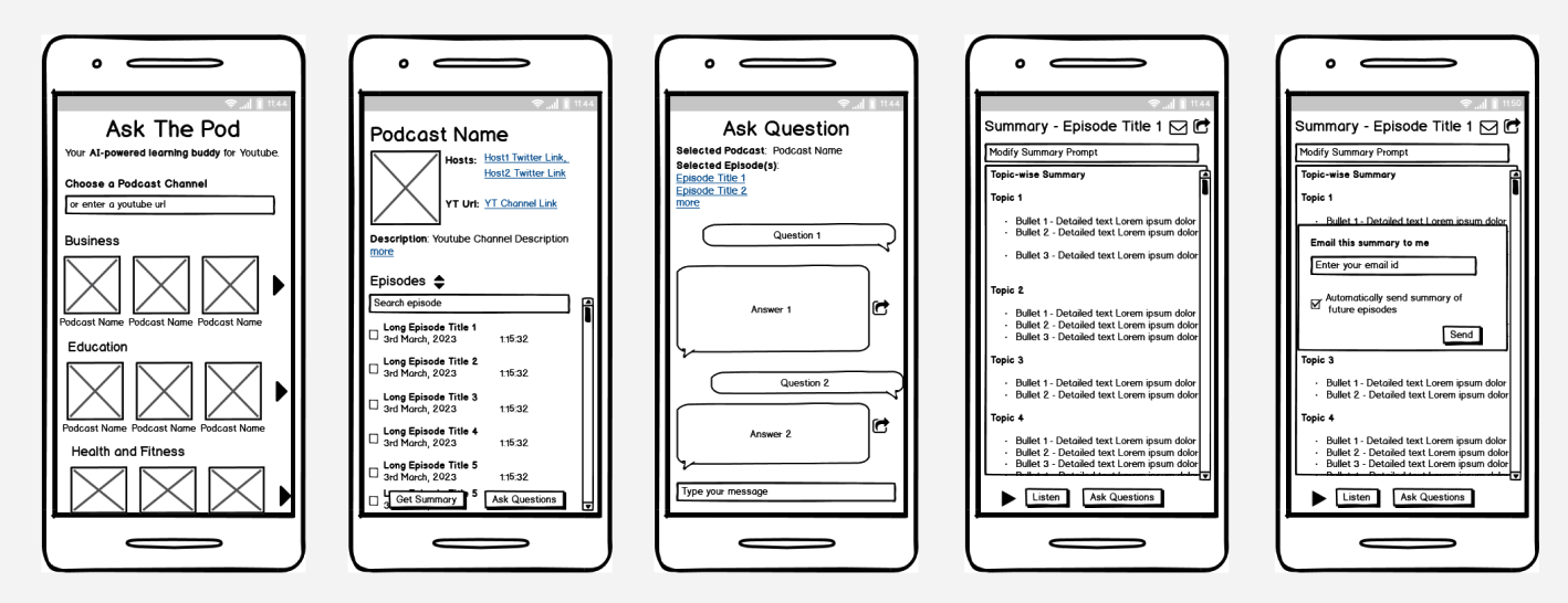
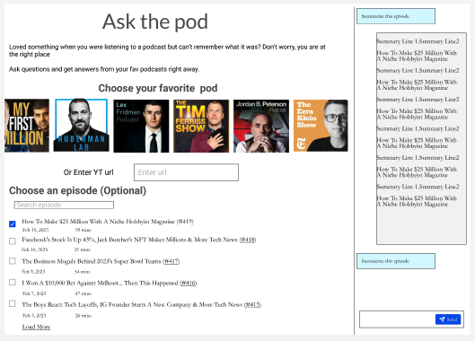
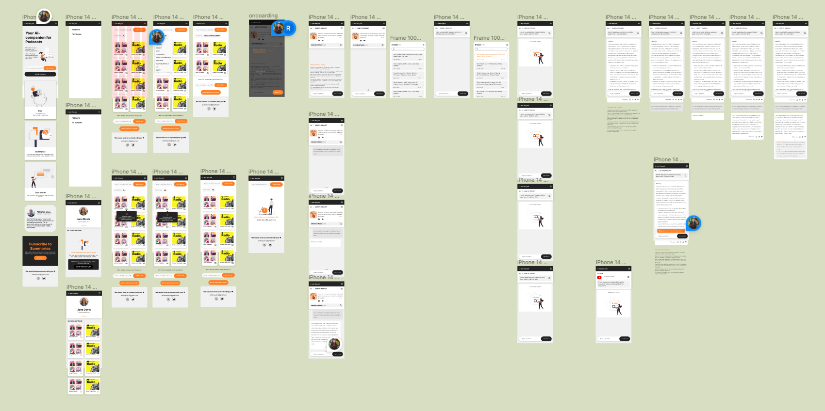
Based on the features we decided for the first release I created wireframes using Figma and shared with the team to get early feedback on the features and functionality.
Final Designs
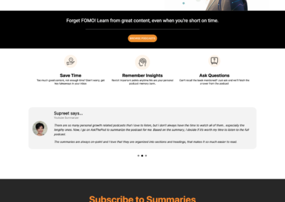
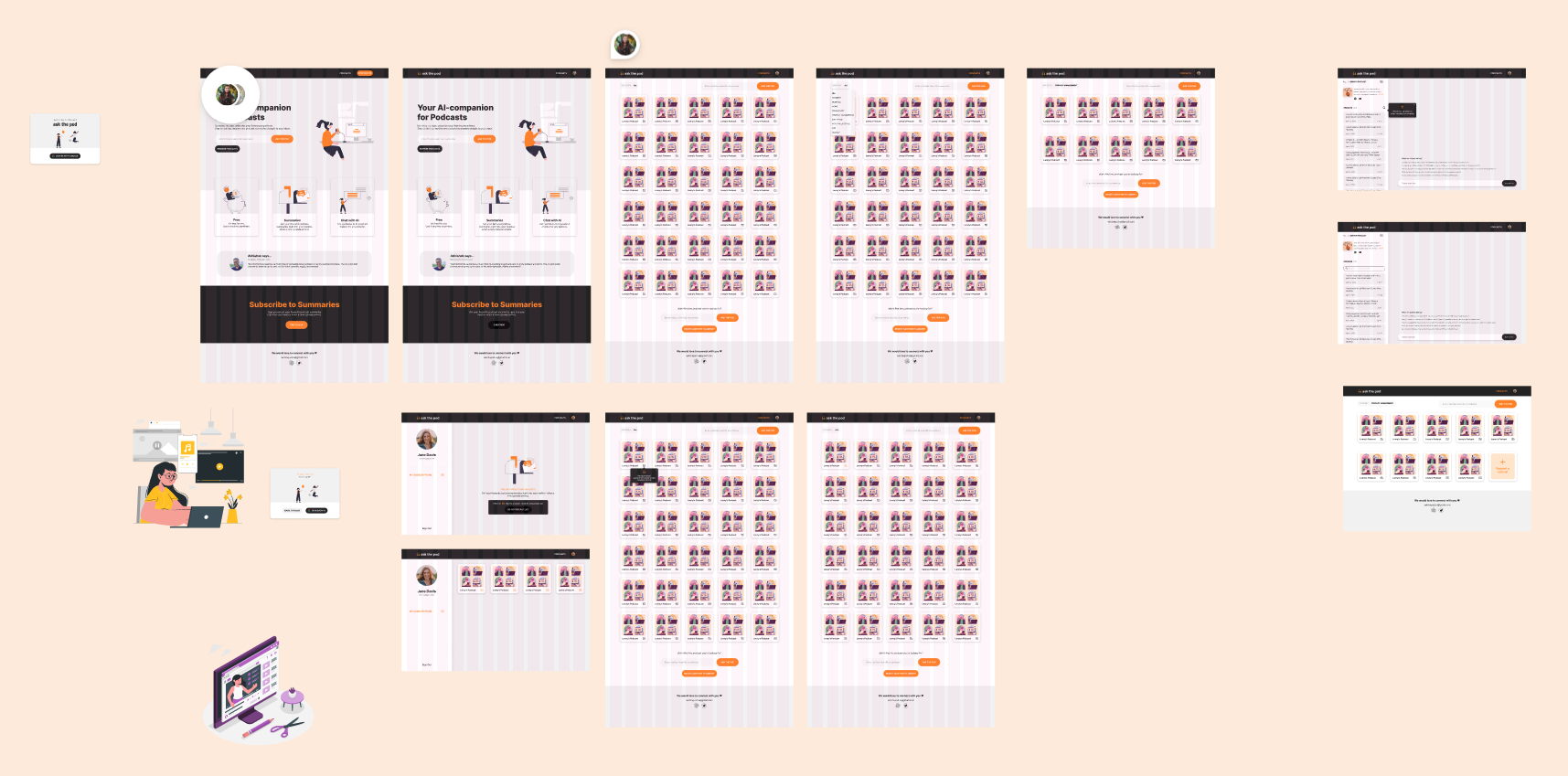
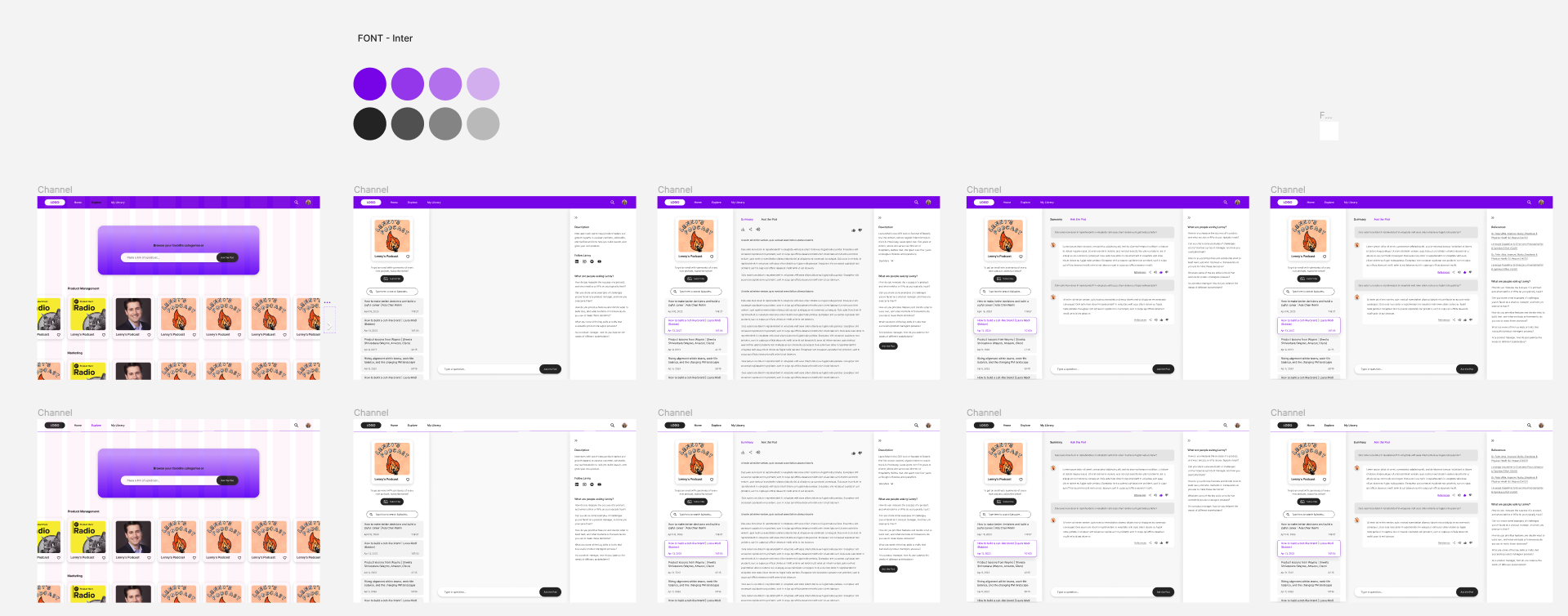
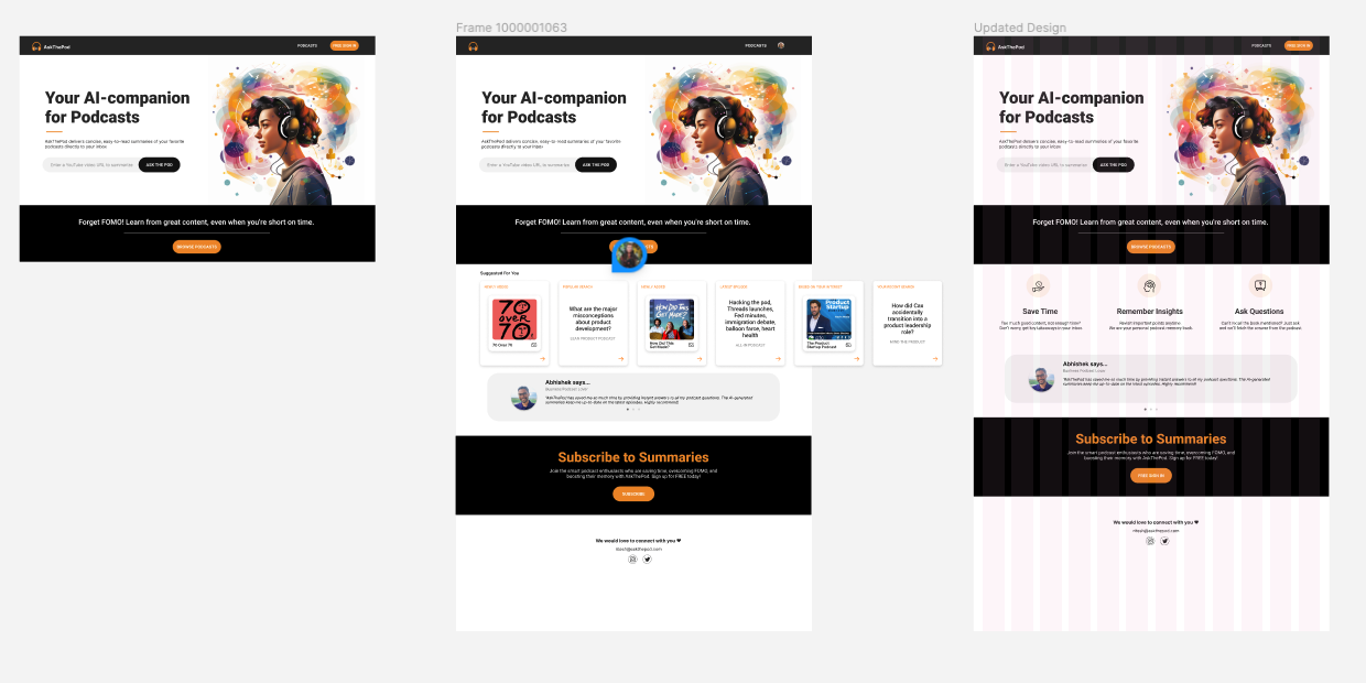
Here are various design explorations
Main Features
-
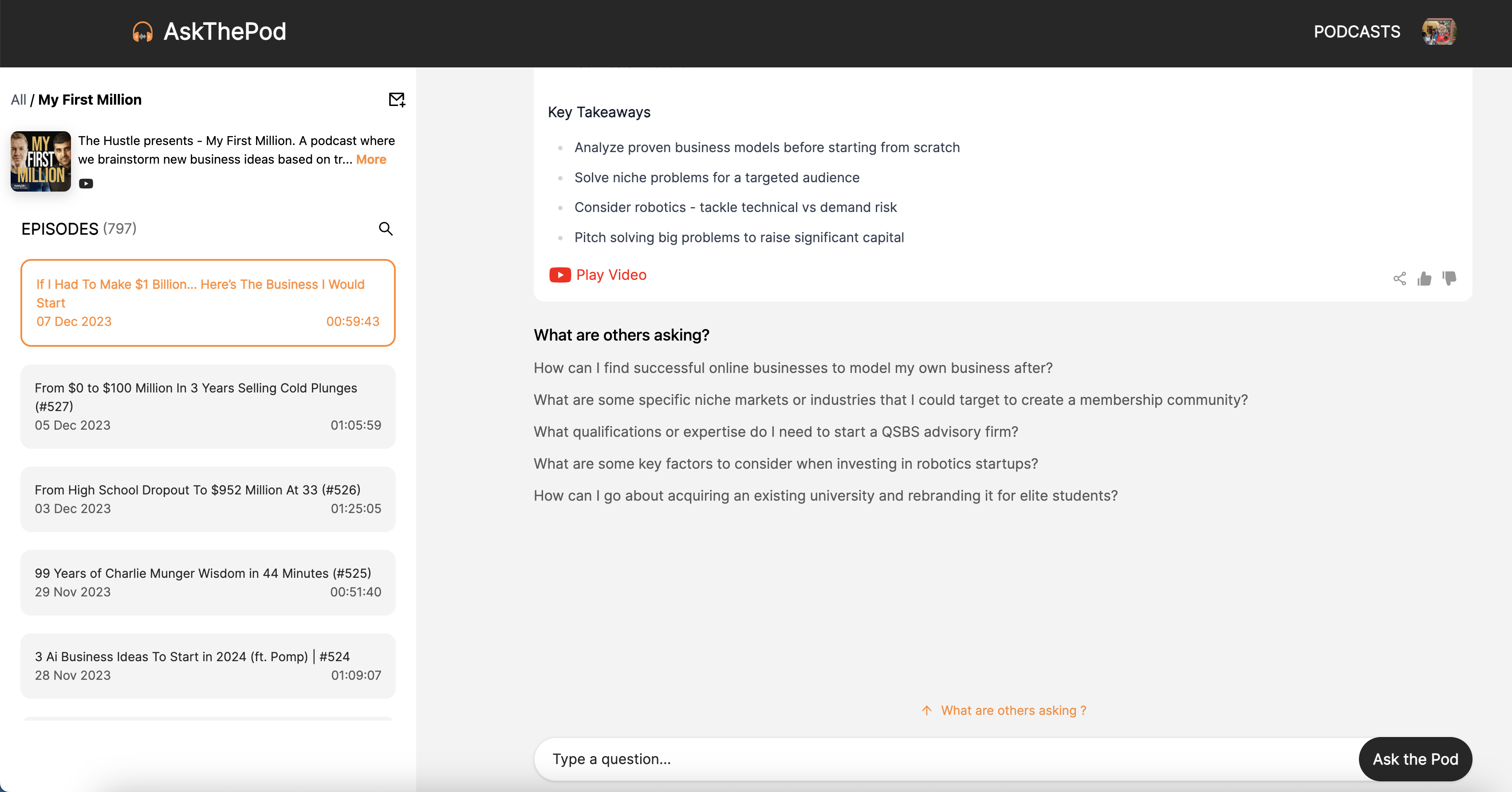
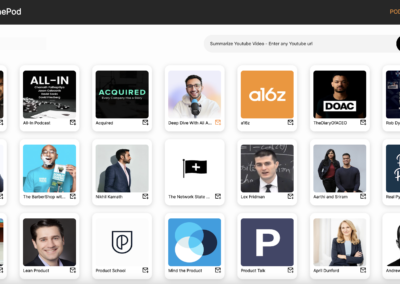
View the list of Podcasts
- Filter by category
- See all the episodes of the podcast sorted by the most recent one
- Search for the specific episode in a podcast.
- Interact with the podcast by asking questions.
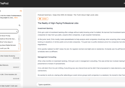
- See AI generated summary and bit size insights from the podcasts.
- Go back to the exact timestamp where the question is being answered.
- Listen to the summary.
User Feedback
The summaries that were generated were text summaries. Since, the podcast lister is more used to listening rather than reading. So we added an option to listen to the summaries.
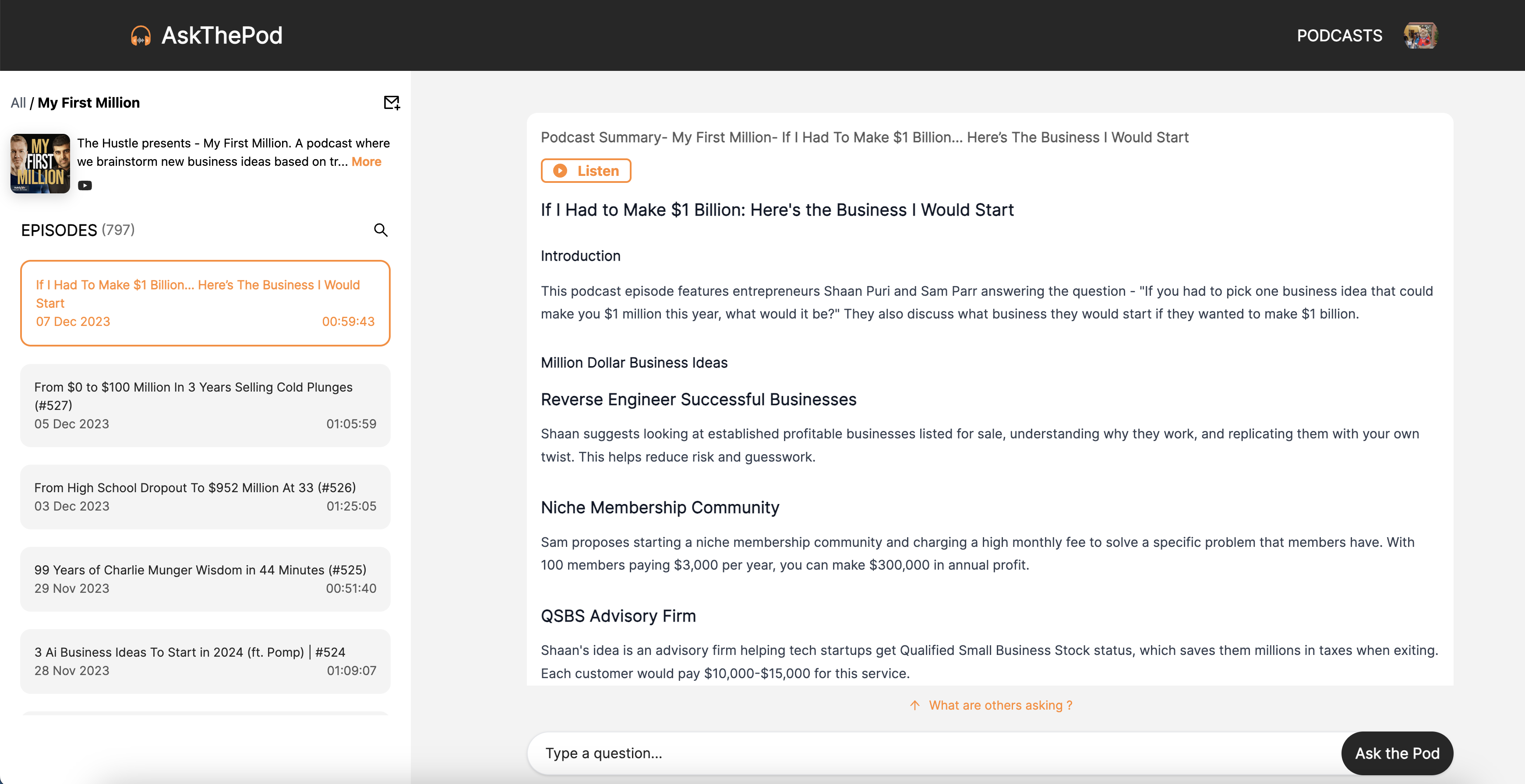
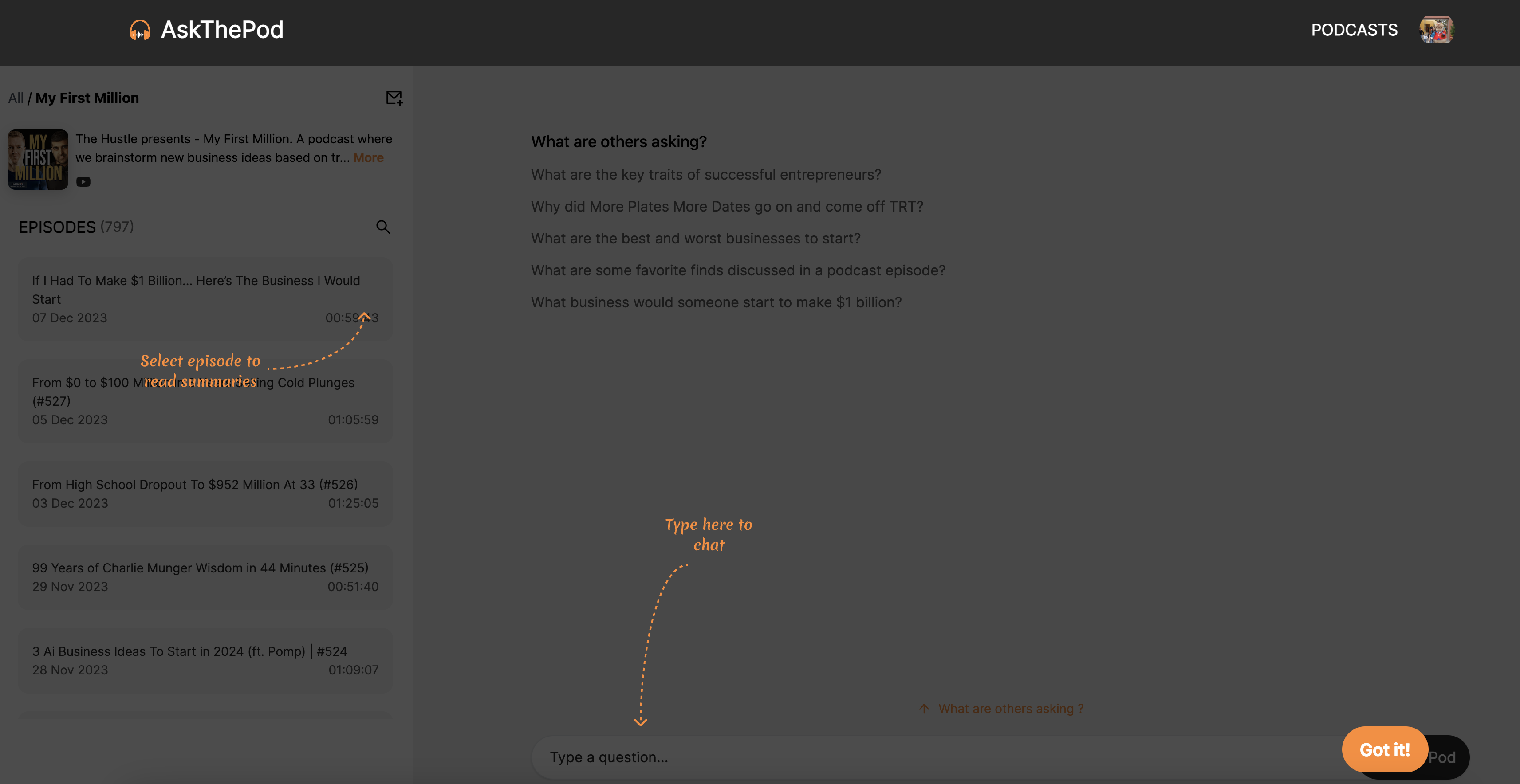
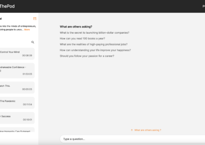
It was hard to explain to the users to ask questions to a podcast, that a new user behaviour, so we added a section called what others are asking and added a few questions to nudge the users to ask their questions. We also added the onboarding prompts to explain where to type in the questions and how to interact with the podcast.
