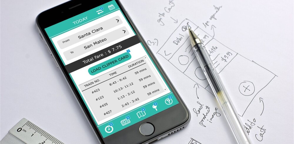
Caltrain
App Redesign – UX Researcher & Interaction Designer
Problem Statement
Travelling by Caltrain can be an overwhelming experience, from buying the ticket to making sure the user gets on the correct train and detrains at the correct station. This is especially true for first time users and riders who require assistance. The goal of this exercise was to redesign the Caltrain App by improving the current design ,including any missing features to enhance the overall user experience.
My Role
UX Researcher & Interaction Designer
Original App Design
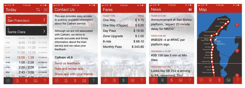
Understanding the Users
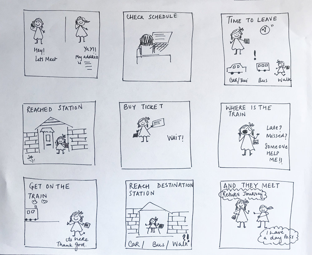
A wide range of people right from children to adults and people with disabilities or those who require assistance travel by Caltrain. Most of the people rely on the App to find the Caltrain that would help them reach their destination. For this project I looked at how the current design of the App can be improved for the usability and ease for the passengers. The first part of our process was to identify the various user group who interact with the App and understand what their needs and expectations are, and what is it that they are trying to find or expect to see in a Application.
User Research
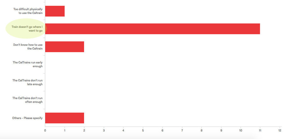
I conducted an online survey using Qualitrics tool to create an online survey to gather quantitative data for the Caltrain users. Once we were able to get responses from a number of people recorded in the tool , we came together as a team to analyze the response. One interesting finding from the survey was that a lot of people do not use the Caltrain because it doesn’t go to the destination the user wishes to go to.
User Interviews
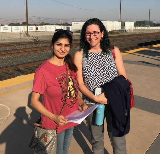
After our initial research, I conducted approximately 20 min interviews with 7 Caltrain users at the Santa Clara station , ranging from frequent users to occasional users to find out if they use any Caltrain app and what problems they face while using it. My primary data collection technique was taking down notes with pen and paper and I used a combination of the structured and unstructured interview techniques
Personas
Based on our user research, I created 3 user personas that encompass the typical Caltrain rider. We came together as a team and reflected on the needs and frustrations of these users as we evaluated the Caltrain app and brainstormed potential enhancements.
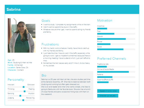
Frequent traveler
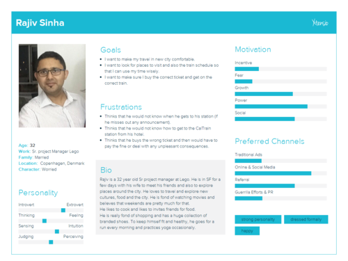
First time traveler
Areas of Improvement
Some of the problems that we identified after the survey and the interviews were –
-
No information about how a person can reach the nearest Caltrain station.
-
No alert or notification about the delay or change in schedule of the train.
-
No option to buy the ticket on the phone.
-
No real time tracking of the train, It makes people especially who are travelling to/from work anxious,
-
No way to report any incident or information like for example if someone left a bag or something.
Sketch Explorations
After conducting the initial research, our team came together to sketch designs for the app. Each sketch experimenting with visual hierarchy, placement, colors, relationships and form.
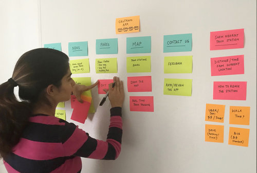
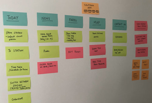
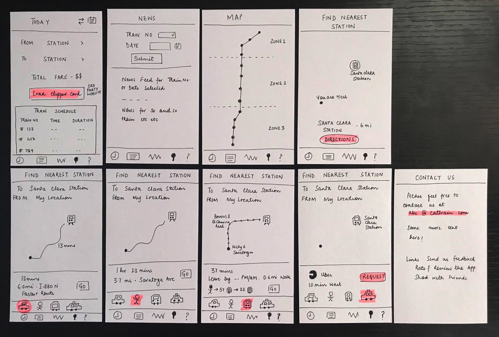
After we got together as a team, we conducted a design critique and evaluated the designs based on the metrics discussed earlier such as use of color, readability, ease of use for all kinds of users. This helped in acknowledging trade offs and narrowing down our design choices.
Visual Design Explorations
We now split up for the team format and worked individually on the visual design. In all we designed 4 visual variations, I designed 2 of them and tested it with users.
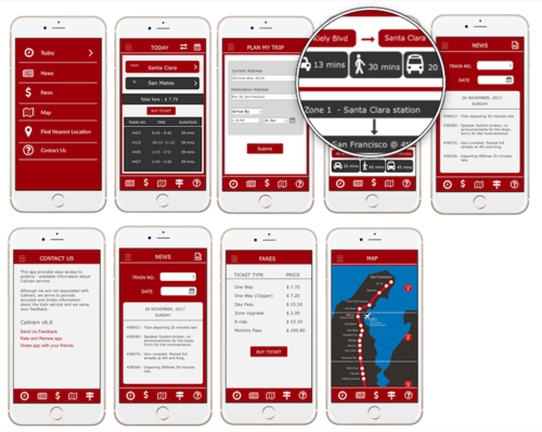
Design 1 – This shows time a person would take in a car, bus and walking from starting point to the train station
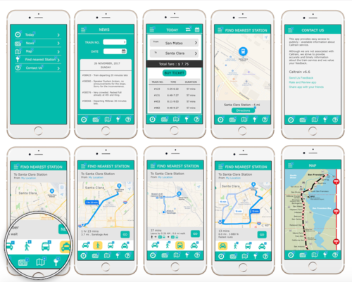
Design 2 – This shows the nearest train station and then shows options to reach the station. On clicking on those options it shows the detailed route.
Usability Testing
We conducted usability testing using userfeel.com . It helped us understand the users thoughts and any problems they faced. Here is the report
Feedback
All the 4 design variations tested well with users but the 2nd design option, tested the best.
-
Finding the nearest Caltrain station first and then deciding how to reach the station stood out the best since going step by step is more intuitive and easier to understand for the user using the app for the first time.
-
The use of teal and white creates a soothing interface to help the user not to get overwhelmed like it was in the case of red and white.
-
The interactive map right within the app helped the users to track their route easily
-
The app dynamically updates calculated fares based on the ‘from’ and ‘to’ destination, but the app’s fares do not match the Caltrain website. To fix this, the app must have regular updates and should state when the last update occurred.
Reflection
I realized that what might seem like a simple problem might have a lot of underlying complexity to it.
Though ease of use is important but that should not mean missing out the on the functionality. The apps we reviewed in the comparative study were all very similar, and while some were prettier than others, the best app is the one that serves the users needs best, with all the needed features and nothing more. Features and core functionality are an essential part of a good user experience.
I enjoyed working in a team where all of us had varied background. Overall, this project helped me hone my visual design skills and I enjoyed every part of it.
The Team
From left – Himeka Hagiwara, Shruti Katyal (me), Amit Sharma, Varsha Chajjed
